Thursday, January 26, 2012

SURRENDER

Every Monday Effy  issues a challenge of a word, a concept, or a technique to those of us participating in the BOOK OF DAYS project. Just as an aside ... the best part about the BOD project is that it is  free so hurry over and sign up now for a wonderful year of glittery love and goodness in the art journaling world.

Our challenge this week was the word "surrender." Sometimes an image or an idea will pop into my head immediate with these kinds of challenges, and then other times the concept has to mutter around in the back of my mind stirring around in my subconcious for several days before a page or spread begins to surface. I've learned over time to not rush the process. It will come in its own time. And that is how it happened with the challenge for this week.

I went on about my business exploring a new ezine calle Sprout from Amanda at Persitent Green. What a beautiful little publication filled with poetry, images, photography, and inspiration. Well done, Amanda. As I read the articles in the themed issued on Abundance my percolating ideas and visions began to take shape. I began to jot notes down on scraps of paper - words and phrases. I began to look at images with a new purpose and direction in mind.

The next step, unplanned and not even a clue as to the coming connection occured after watching Jeanette in her Creative POP video for January share her exploration of charcoal drawing while working on a image of a face inspired by a magazine photography. Faces seem to crop up a lot on art journaling spreads. I'm not sure why. It may be that using an image of a human being gives life and verbal power to the journaling message. It may be that using an image of a human being could invoke empathy for the emotions shared on the page. I'm not sure and this is pure speculation. I've played around with including people on my pages and sometimes it works and sometimes it feels contrived. However I do believe what better place to explore and experiment than in your daily art journal. I've never really thought of myself as having much ability for drawing realistic images, but I think this goes to show with practice, one does find their skills improving over time.

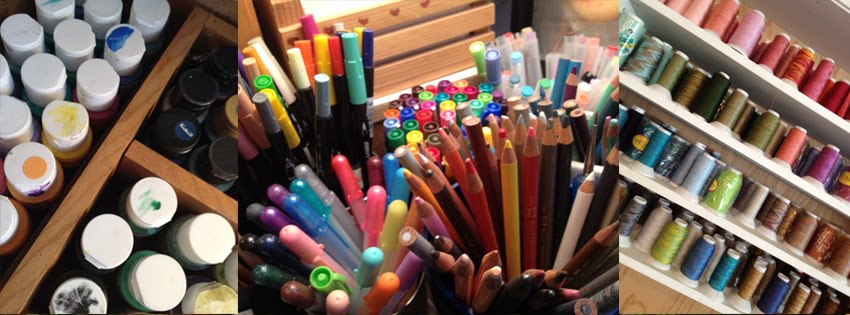
Well, the rest is history. You can see my "work-in-progress" as I integrated all of these prompts as they came together in one spread. I started by preparing the base pages with gesso and then used sketching and charcoal pencils to create a light sketch as an idea for the page. When I had everything the way I liked it I started firming everything up more permanently with my Pitt pens. What is next? I think I'll be playing with my Inktense pencils and color blocks and, of course, finishing out the lettering and text with my Pitt pens. I think, the way I'm using these pens every day, I'd best be looking for a bulk supplier. These pens are the best for working over mixed media like acrylics, watercolor, inks, and pages that have been coated with Fixatif or sealed with a matt medium.

SOLILOQUY

ART JOURNAL CARAVAN 2012 has a whole new format this year. Tangie has us focusing on a word prompt but I think our words this year a from "How To Increase Your Vocabulary by 52 Words in One Year." Whew, these are words that I know but don't often appear in my day-to-day conversation and keep me thinking about how to get down on the page with images.

This week was a little easier. Soliloquy basically means "talking to yourself." LOL And there is plenty of chatter going on in my head at all times. I did notice that it only took me a couple of days during the week Mike was gone to start my own personal conversation, my on-going soliloquy once again.

This was a fun spread to work with lettering while I journaled about all the decisions I talk myself through as we work on phase one of finished the other side of the house ... Toby's studio and living quarters for the summer seasons at Tanglewood.

Supplies used on this spread include: A collage background using images from collage sheets Tangie Baxter shared with all the people participating in the Book of Days project plus tissue paper. The base was prepared with gesso and I used Pitt pens from Faber Casterll for the lettering. The outlining with done with a white Gelly Roll pen.

Wednesday, January 25, 2012

STAMP CARVING 101


I've been having a blast in another on-line class with Julie Fei-Fan Balzer. This time I'm taking Stamp Carving 101 and learning all kinds of tips and tricks about carving my own rubber stamps. This is the journaling I did for January 24th and 24th about stamp carving and the good time I've been having with the class as I learn new techniques and materials to use that are different this time around.

I really had to chuckle inside as we worked on the first lesson. It was just like teaching beginning machine applique. We started with an open heart so we could learn how to do inside and outside points and inside and outside curves.

I did some hand carving of rubber stamps years and years ago. I found a few of those stamps while unpacking boxes (yes, I'm still unpacking boxes - a job that will probably haunt me for the rest of my life) while I was looking for texture stamps for creating backgrounds for my pages. I was also looking for alphabet and number stamps. Now the funny thing about that is, just a short year ago when Eryn was here we went through some boxes and I gave her any of the alphabet stamps sets she wanted because my thought was, "When will I ever be using or needing these stamp sets?"  Just goes to show, you never know what lies in the path ahead.

On with Lesson Two of the class ... we worked on creating interlocking or nesting stamps. These stamped images were like mirror images. We carved stripes in the block and then carved an identical block removing the opposite strips.

And last week we worked with a project Julie calls "contained chevrons." Doesn't this create a cool pattern. I love using it for a tag design and will be making some tags with this stamp to send out in "Happy Mail" packages to my Book of Days friends.

I added a few more carvings of my own just for fun and extra practice. I like the texture created with the rounded rectangle shapes that look like a remote control to me. I tried carving a Queen Anne's Lace flower stem. It's not light, airy, or lacy like the real flower is, but I rather like the primitive nature of this image.


And then I carved a word. Sentiment stamps can be fun but I think you must be careful with the frequency of use. Another words, you don't want the same message coming up on every project you create. However, I figured the word "enjoy" would have enough places or times it could be used to justify the time spent carving. So meticulous in design and execution ... I worked like a master. And then I was ready for the first test stamping. OOPS ... forgot about reversing a directional or word design ... sigh ... note to self ...

Sunday, January 22, 2012


It was a day for "arting with Effy" during COA and playing with supplies and techniques.

Chickadees have been my favorite bird since I was 5 years old so it only seemed fitting that he would make an appropriate subjuect for my watercolor practice.

My chickies on the next page were the result of my trying some dripage with watered-down acrylic paints and then letting the images "talk" to me. The little orange chickies appreared out of nowhere on the page just like the little birds at the top of the page sitting on the fence posts. Sorry they got cut off a little in the scan. It just seemed to me like the "very formal" little chickadee was looking over to the three little chicks on the next page and saying,

"What's happenin' over there? Stop looking at the ground. Look up. Spread your wings, little chickies. Get ready to fly!"

And while I was working on the lettering I remembered loving the springtime in Oregon when the chickadees, the junkos, and the barn swallows would be lined up on the power line that ran from the garage to the house. Those babies were all taking turns learning how to fly with the mamas and the papas swooping around showing them how it is done.

Inspiration: images from the internet, Donna Downey, Effy Wild, Tangie Baxter, and Sandra van der Geest.

IT'S ALL ABOUT STYLE


I had great fun putting together the stylish bird lady. I was going to use her for one of the weekends we went into Boston for a symphony concert. Dressed like that would just be "going in style" but we ended up playing with the twins and going out to dinner with the family rather than going to the concert. What's a girl to do ... all dressed up and changed where we were going.

The background is collage tissue paper and stenciled letters with a little bit of acrylic paint for fun. Printables are from Tangie Baxter: Collage sheet Mania Bundles, and then then I played with my watercolors a little adding the tree and thr ground/lawn for the house.

Quote from Coco Chanel: Fashion Fades. Only style remains the same.

Saturday, January 21, 2012

IT WAS A GOOD DAY


Yep ... a very good day ... a day to make one smile ... a day to remember when things aren't so good.

Supplies used ... all from Tangie's new kit UP UP AND AWAY except for the bird which is from Sherrie JD's Viva Frida

Thursday, January 19, 2012


a visual reminder to keep things simple, to not overthink or read too much into a given situation

Supplies used: collaged onto my painted background are digital images from:
Tangie Baxter: Deconstructed No. 2 and Black Licorice
LMurphy: Charming Women
I also used pan pastels, Pitt pens, and a white gelly roll pen for adding details.

Sunday, January 15, 2012

ARTING WITH EFFY

 
I spent the day creating backgrounds in my altered book while chatting through a live stream with Effy and friends and watching Effy create a painting. Such good information about working with inks and colorwashes and tips about layering and which mediums to use with what type of material. My journal spread for the next couple of days is all ready for the pen. I love my little hummer stencil. I found him packaged up with 3 other cupcake stencils on the dollar aisle at Michaels. Love it when I find a good bargin like that.

All in all, it was a good day for arting in the studio as it was still zero degrees outside even at noon; our high this afternoon was 8, and I never was able to get the studio warm enough to run the longarm even with the pellet stove running full blast. Not good weather for quilting, but good weather for arting.  Read on for details on a couple of spreads I worked on today.

This spread was really fun. I started with the pages of my book coated with gesso and then splatted a little bit of colorwash ink on the page and smudged the leftover ink from my bird stencil from the previous page. From there I collaged bits and pieces from the paper towel I was using to mop up extra liquid from my pages and gave the edges a little bit of stain with the butterscotch distress ink from Ranger. After that it was a little bit of this and a little bit of that with layers of paint as I searched for the right patina for my page. I used an empty paint spool as a stamp for my circles, sprayed a bit more ink to the page and decided that was enough for now. I'm not quite sure how I'll be able to journal over the texture of the paper towels, but I'll leave that to be solved another day. For now, I like my spread.

This next spread has created a little bit of a challenge in a different way. I remembered the fun I had and the dramatic effect created when prepping the page with black gesso. So I decided to do another spread that way. I also wanted to use one of the catherdral stencils I got from Artists Cellar last week. I used my pan pastels to add the color and used Fixative to seal the color. At Effy's suggestion I outlined the stencil sections with silver ... my silver quilt marking pencil is finally put to good use.

It's a very dark page, but I love the way the red "burns" like embers. I'm not quite sure how I want to continue with this page and how the journaling with fit with this design. I think this page needs some thinking and percolating time. If you have any ideas or thoughtS, drop a line in the comment box.


Thursday, January 5, 2012

CLASSES AND WORKSHOPS

I suffer from an insatiable hunger for learning new things. And to satisfy that hunger I've found myself signing up for a multitude of on-line classes and workshops having to do with mixed media and art journaling. And now, to keep them all straight!!!
 
 
I figured out there were year-long workshops that I could integrate into the altered book format I'm using for art journaling and then there are all kinds of inspiration spots and stops along the way.

To integrate ...
Art Journal Caravan with Tangie Baxter: this is my third year on this adventure. Every year I do a little more and learn more than my poor little peabrain can handle. But I wouldn't miss is for the world.
 
 
Book of Days with Effy Wild: after getting the daily art journaling habit going with Julie Fei-Fan Balzer I was on the search for another group to help me continue with the habit. And then Effy's workshop popped up. The best part ... it's FREE and packed with all kinds of inspiring goodness.
 
 
Be a Seed with Milliande: another freebie that is going for as long as the inspiration keeps flowing. You just can't help but be in awe as you watch her work.
 
 
One Little Word with Ali Edwards: its so simple and Ali is a whiz a breaking things down into a do-able format, and AJC and BOD are both based on choosing a word for the year, so I figured I might as well play along with Ali, too.
 
 
And for inspiration I'm starting with:
  • Doodles Unleashed with Traci Bautista - a freebie with Strathmore
  • Inspiration Wednesday with Donna Downey - grab your coffee and watch her work.
  • Stamp Carving 101 with Julie Fei-Fan Balzer - you know, I was doing all this stamping way back before they "invented dirt" but I decided I'd better see what was new about the whole process, plus, I just love Julie's classes.
There will be more classes and inspiration down the road as I get further into the year, but this is a start for now and I'm having a blast getting my fingers all sticky with ink and paint stains on the palms of my hands.

About my first journaling spread ... I would like a little more art on the page but I love the color combination. Still struggling with getting my Pitt pens to work over all the paint/gesso layers but I'm feeling really good about my lettering style.